Itaú App Redesign
ROLE
UI designer, Lead Designer.
Background
Itaú is the largest private bank in Latin America. Itaú always had one one the most respected in-house design offices in Brazil, having their own brand designed by the late Alexandre Wöllner, one of the godfathers of Brazilian Graphic Design.
OVERVIEW
Working for a development consulting agency called Concrete Solution we had a squad of Backend developers, iOS, Android developers, DevOps already working for the upcoming Itaú App. The UI designers, me and two more, were allocated for the redesign project. The redesign were led by Itaú Design team and Huge Inc and after the early stages I helped branching out ideas, building structure for new elements and how they would behave on a design system also the icon font they considered a must have. At Itaú UX and UI designers have separated roles, so I had more discussion about what the UX team would present to bank committee than to work hands on wireframes and testing.
THE CHALLENGE
Their first application were developed using Kony, and the bank were receiving way too manybad reviews and people suggestingthey needed to have more featuresthat would help them not going to the bank. Also brand identity, UI and using illustrator as UI design tool were far from what the Design team wanted.
GOALS
To bring Itaú's mobile app to an impeccable experience, visual consistency with brand guidelines, to change for the better how their clients use their banking services and last but not least make Itaú a global reference in digital services.
Design Principles
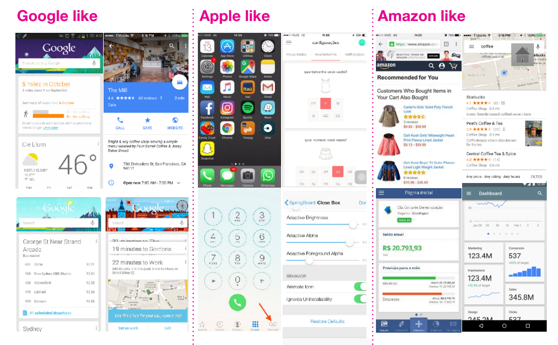
The visual references were divided into 3 major groups.
Easy to find - Google like
Easy to learn and use - Like Apple
Sales, context and managing - Amazon Like
It also had to:
1. Got to be good looking
2. WOW!! Effect
3. Straight to the point
4. Attention to details
5. Human Centered Design
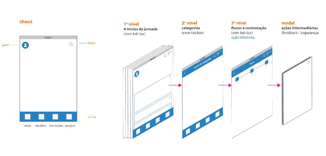
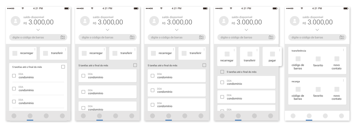
Starting Point
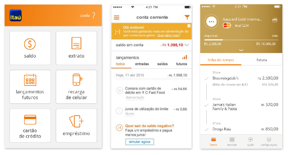
As shown before, the references didn't came out of nowhere as the direction for the new app didn't as well. Itaú had a new app for their credit card (3.Itaucard) and the two other screens are from their previous version ( 1 and 2 ). Itaúcard app already had an expanded color guide, ilustration and a tab bar and both had apps had an icon set.
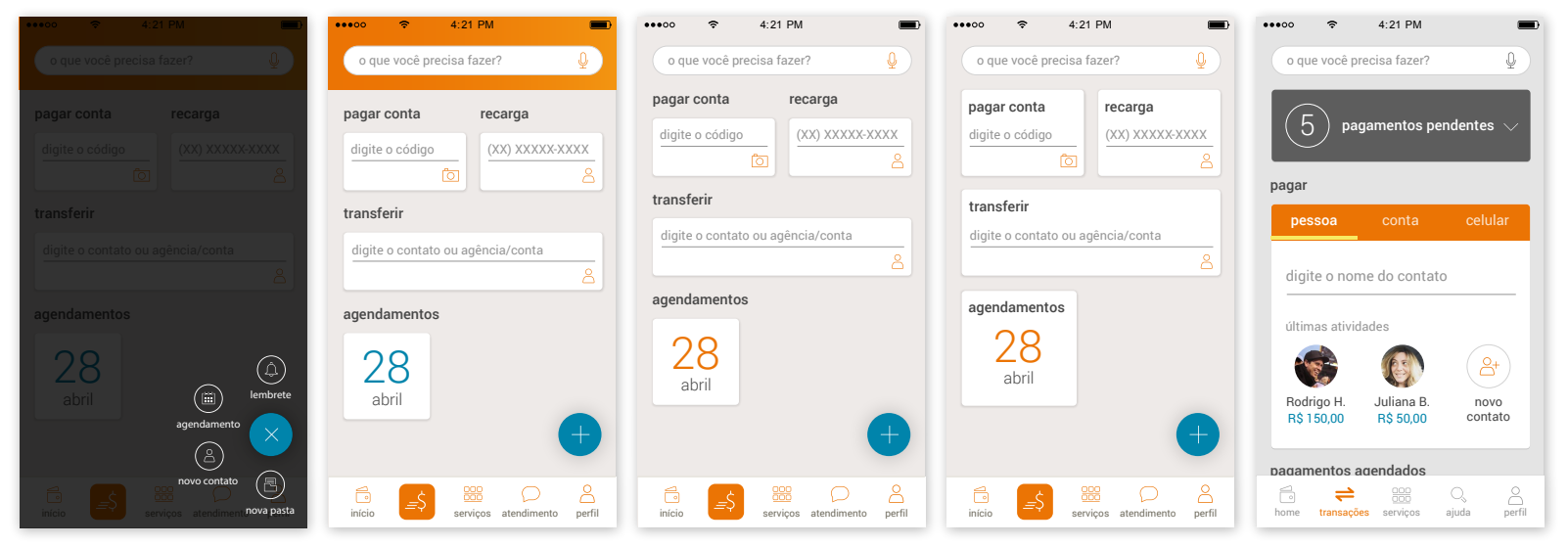
Early sketches
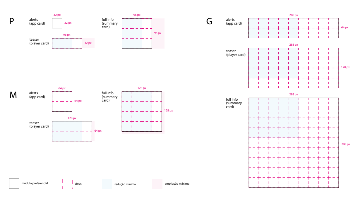
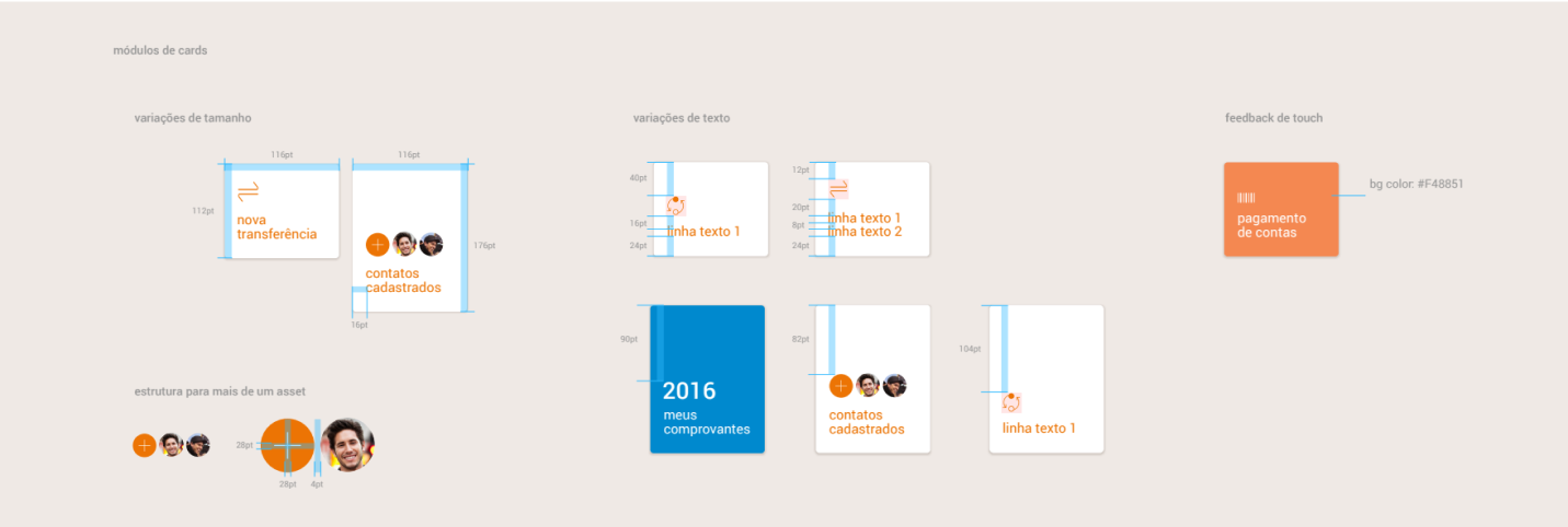
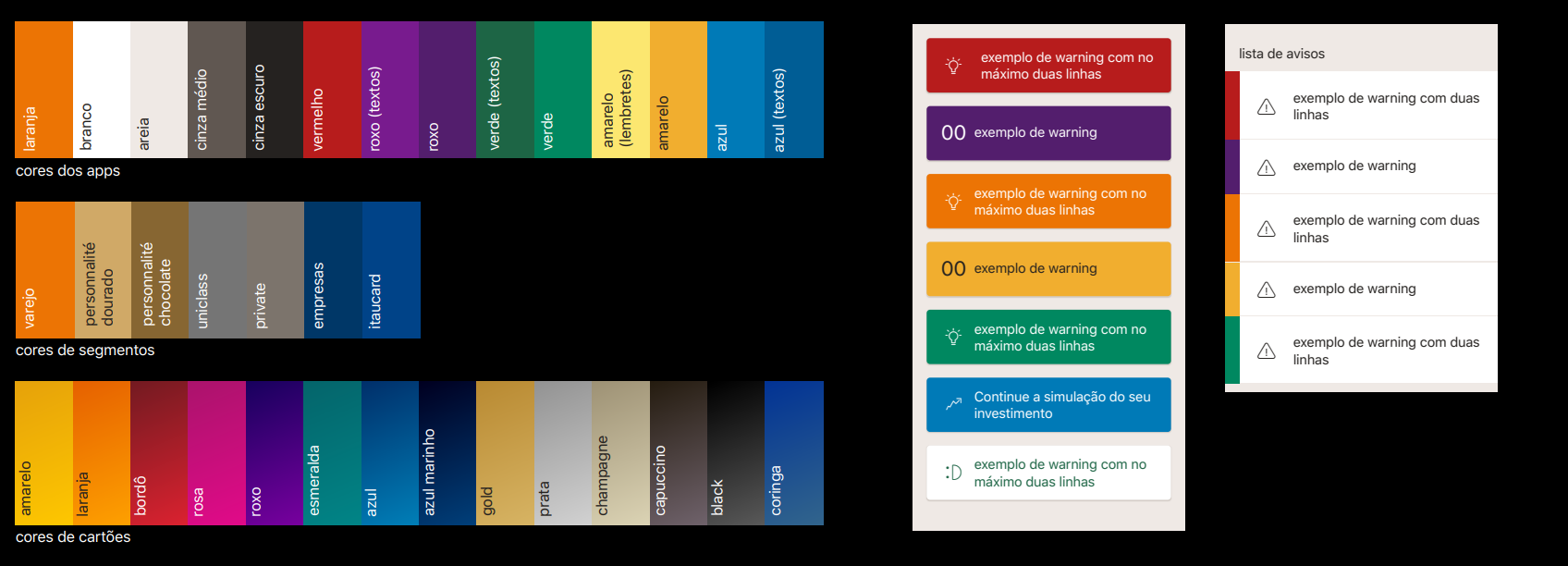
Library and Guidelines delivery
This documentation and library was done in illustrator, this was before Sketch App implementation as the bank official tool for designing.
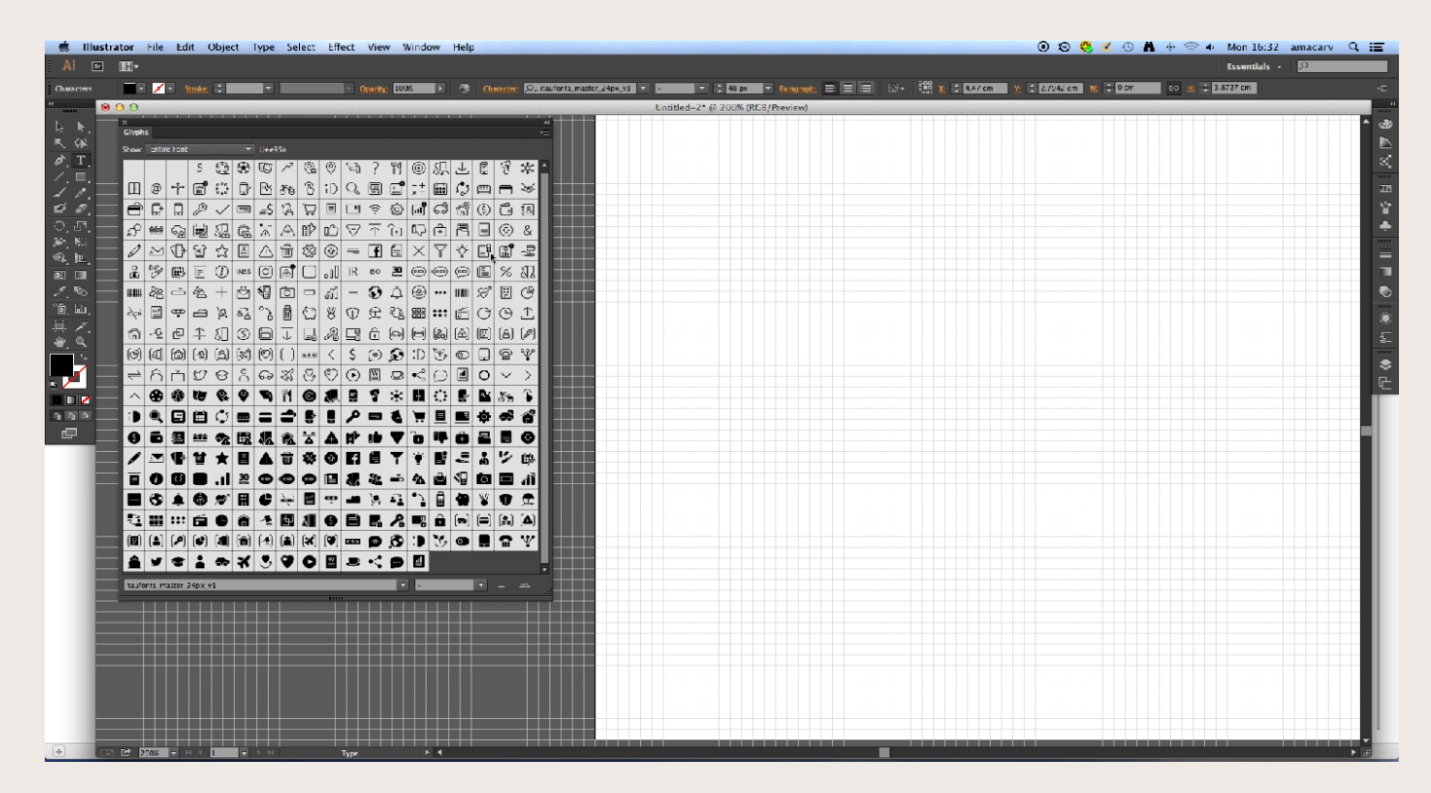
Itaú Icon Font
The goal was to improve performance, usage and quickness when using icons and no need to export them in different sizes. It did help a lot when escalating squads
Off to development
After the redesign project ended, Itaú hired 14 UI designers to work on their squads, together with their ux designers to draw UI and expand the design library. I was asked to lead them since I’ve worked during the redesign project.